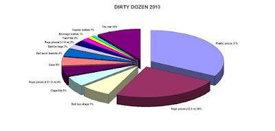
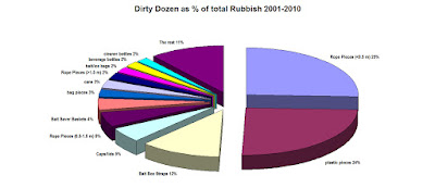
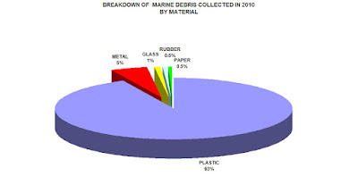
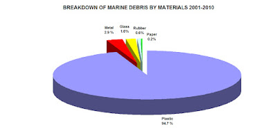
Below are two sets of graphs. The first are the 2010 graphs and below them are the 2001-2010 combined survey graphs. Click on the graphs to enlarge


The below graph shows the items collected for the Dirty Dozen between 2001-2010. Note that in 2009 the numbers are generally lower than other years. 2009 was the year we experienced the worst weather of any trip and spent the majority of the survey inside the protected waters of Port Davey. This meant we were unable to survey the west facing beaches that generally 'catch' most of the rubbish.
It is also worth noting that in 2007 we also surveyed 'Beercan Bay' and we see the same if somewhat smaller spike in Aluminium Cans.


 More stats to follow in the coming weeks.
Run a pie chart delligator!!!
ReplyDeleteThis is an inspirational project. Congratulations, thanks for all your hard work and the great photographs.
ReplyDelete